EPISODE #007 — Where Does Productivity Actually Come From?
In the previous episode, we asked how many people are actually employed. That moved us from demographic capacity to labor utilization. We now take the next step: how much output does each employed person generate?
A country may have a large labor force and high employment, yet still produce less value per worker than another economy. To understand differences in GDP per capita, we must therefore separate the number of workers from the amount of output produced by each worker.
Takeaway
Employment tells us how many people work. Productivity per worker tells us how much output each worker generates.
In this episode, employed persons are computed as:
Employed persons = Labor Force × (1 − Unemployment Rate)
Productivity per worker is defined here as real GDP divided by the number of employed persons:
Productivity per worker = Real GDP (constant 2015 US$) / Employed persons
Table 1 provides a 2024 snapshot for the G7. It compares the number of employed persons with output per employed worker.
The 2024 ranking shows a clear separation. The United States stands well above the rest of the G7 in output per worker, while the United Kingdom, France, Canada, Germany, and Italy form a relatively compressed middle range. Japan remains structurally lower, suggesting that the gap is not primarily demographic but reflects lower output per employed worker.
| Rank | Country | Employed Persons (2024) | Productivity per Worker (USD, constant 2015 prices) |
|---|---|---|---|
| 1 | United States | 165,370,864 | 136,472 |
| 2 | United Kingdom | 33,440,489 | 99,285 |
| 3 | France | 29,471,402 | 92,305 |
| 4 | Canada | 20,780,089 | 88,246 |
| 5 | Germany | 42,283,025 | 86,963 |
| 6 | Italy | 24,129,373 | 84,279 |
| 7 | Japan | 67,467,207 | 68,270 |
Table 1. G7 employed persons and productivity per worker, 2024.
Source: World Bank, World Development Indicators; author’s calculation.
Note: Employed persons are computed as labor force × (1 − unemployment rate). Productivity per worker is real GDP (constant 2015 US$) divided by employed persons. Productivity values are rounded to the nearest dollar.
A single-year snapshot does not show how the ranking emerged. Productivity differences are shaped over time through changes in output, employment, and shocks. To see this longer movement, Tables 2 and 3 report selected anchor years from 1991 to 2024.
For readability, both tables use the same anchor years: 1991, 1995, 2000, 2009, 2019, 2020, 2024. The underlying dataset covers every year from 1991 through 2024.
| Year | United States | United Kingdom | France | Germany | Canada | Italy | Japan |
|---|---|---|---|---|---|---|---|
| 1991 | 81,651 | 64,358 | 70,234 | 67,687 | 65,383 | 74,591 | 57,809 |
| 1995 | 87,025 | 74,868 | 75,648 | 71,185 | 70,745 | 82,667 | 58,433 |
| 2000 | 98,003 | 84,546 | 83,133 | 77,694 | 78,398 | 89,323 | 61,570 |
| 2009 | 110,237 | 90,018 | 84,704 | 78,572 | 79,838 | 81,883 | 64,091 |
| 2019 | 124,703 | 97,316 | 93,259 | 87,032 | 88,222 | 82,348 | 68,550 |
| 2020 | 126,374 | 87,791 | 86,036 | 83,354 | 85,740 | 74,878 | 65,402 |
| 2024 | 136,472 | 99,285 | 92,305 | 86,963 | 88,246 | 84,279 | 68,270 |
Table 2. Productivity per worker in the G7, selected years, 1991–2024.
Source: World Bank, World Development Indicators; author’s calculation.
Note: Productivity per worker is defined as real GDP (constant 2015 US$) divided by employed persons. Productivity values are rounded to the nearest dollar.
| Year | United States | United Kingdom | France | Germany | Canada | Italy | Japan |
|---|---|---|---|---|---|---|---|
| 1991 | 119,129,560 | 26,403,201 | 23,508,134 | 36,712,551 | 13,145,100 | 21,329,335 | 62,847,966 |
| 1995 | 127,005,781 | 25,854,065 | 23,124,260 | 36,725,415 | 13,500,971 | 20,221,997 | 64,786,388 |
| 2000 | 139,291,367 | 27,373,368 | 24,368,774 | 37,145,493 | 14,837,049 | 20,788,075 | 64,751,573 |
| 2009 | 143,626,312 | 29,157,684 | 26,777,175 | 38,506,389 | 17,007,744 | 22,973,886 | 63,235,491 |
| 2019 | 160,874,704 | 32,772,325 | 27,965,379 | 42,233,062 | 19,231,073 | 23,341,327 | 66,584,012 |
| 2020 | 155,313,967 | 32,677,681 | 28,057,663 | 42,274,894 | 18,790,834 | 23,393,503 | 66,879,118 |
| 2024 | 165,370,864 | 33,440,489 | 29,471,402 | 42,283,025 | 20,780,089 | 24,129,373 | 67,467,207 |
Table 3. Employed persons in the G7, selected years, 1991–2024.
Source: World Bank, World Development Indicators; author’s calculation.
Note: Employed persons are computed as labor force × (1 − unemployment rate).
The tables show the numerical pattern, but the time path becomes easier to grasp visually. Figure 1 plots productivity per worker from 1991 to 2024, and Figure 2 plots employed persons over the same period.
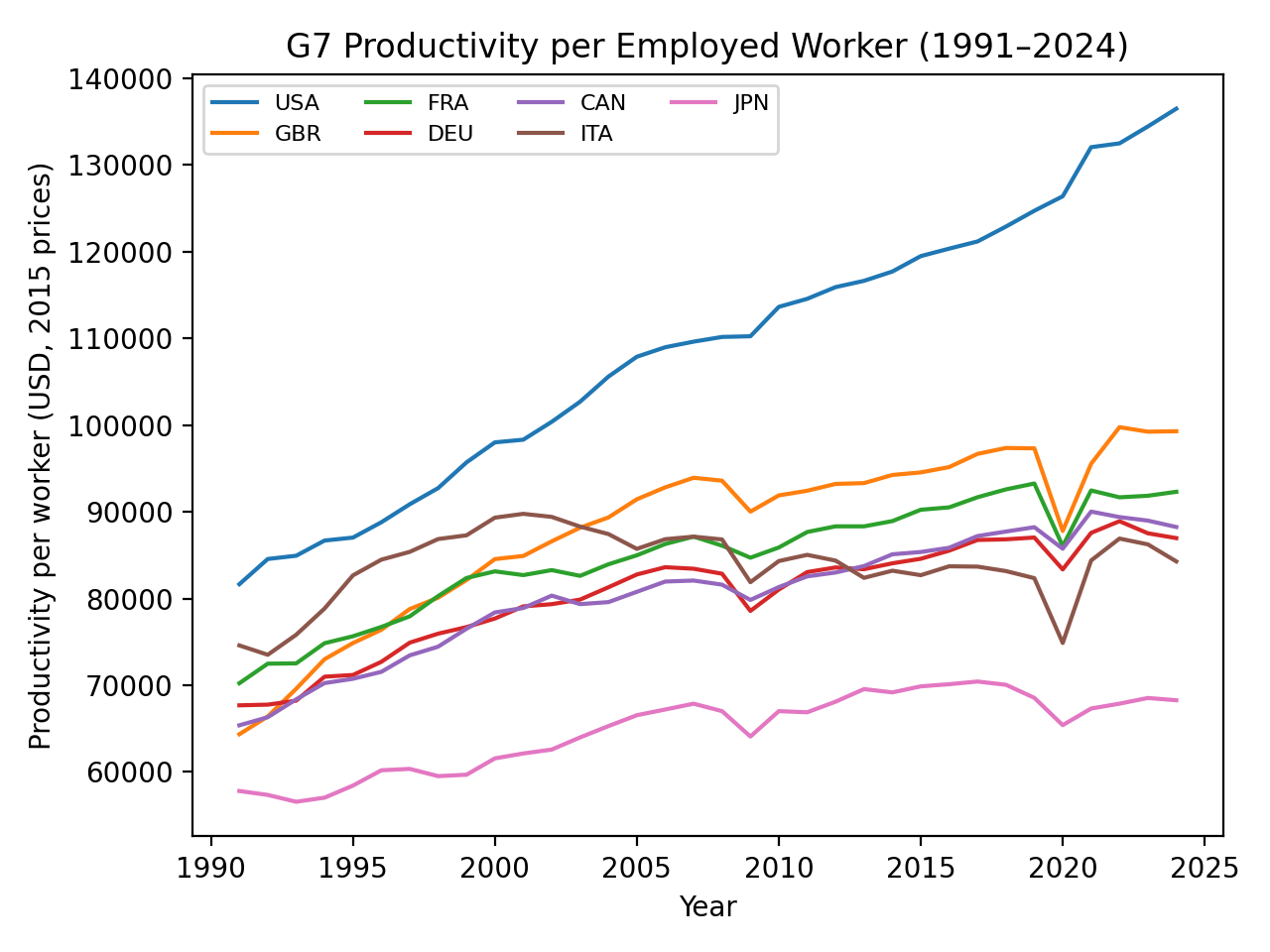
Figure 1. Productivity per employed worker in the G7, 1991–2024.
Source: World Bank, World Development Indicators; author’s calculation.
Figure 1 shows that the ranking of productivity per worker is highly persistent over time. The United States maintains a clear lead throughout the period, while Japan remains structurally lower despite gradual improvement. Major shocks, including 2008–2009 and 2020, appear in the series, but they do not overturn the underlying ordering.
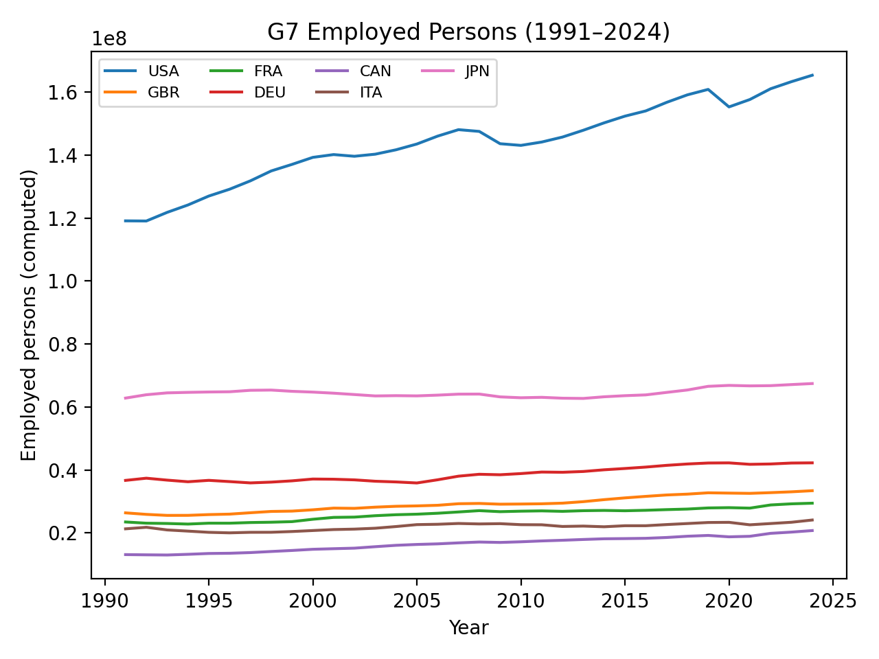
Figure 2. Employed persons in the G7, 1991–2024.
Source: World Bank, World Development Indicators; author’s calculation.
Figure 2 shows that employment expanded in most G7 economies, though at very different scales. The United States added workers strongly over time, while Japan’s employment level remained comparatively stable. The figure therefore helps separate two distinct questions: how many people work, and how much output each worker produces.
Takeaway
Differences in GDP per capita are driven not only by how many people work, but by how much output each worker generates.
Across the G7, the long-run ranking of productivity per worker is remarkably stable.
Unresolved Question:
→ Is the productivity gap driven by sectoral composition, or by productivity differences within sectors?
Next:
EPISODE #008 — Does Labor Allocation Align with Value Creation?
All tables and figures on this site are generated from publicly available macroeconomic datasets.